Have you ever scrolled through social media and noticed certain designs immediately catch your eye while others go unnoticed? Chances are, those attention-grabbing designs are using strategic color schemes. Colors do more than look pretty – they influence perception, evoke emotions, and even affect purchasing decisions. For digital product creators, mastering color can be the difference between a template that sells and one that collects dust.
In this article, we’ll explore 5 color schemes that will instantly enhance your digital products, provide practical tips for applying them, and suggest resources from landom.store to make your design process faster and more professional.
1. Bold & Vibrant
Description:
Bold and vibrant color combinations, like turquoise, coral, and bright yellow, are energetic and playful. They grab attention immediately and work best for social media graphics, promotional banners, or any product that aims to excite and energize your audience.
Tips for Using Bold Colors:
- Pair with neutral backgrounds to prevent overwhelming the viewer.
- Use sparingly for text or key design elements to create contrast.
- Test readability – some vibrant colors can clash when used together.
Example Use:
A digital planner cover with a coral background, turquoise accents, and yellow icons can pop on Instagram and entice downloads.
Suggested Products from Landom.store:
- Vibrant Social Media Template Bundle – pre-designed templates in bold color palettes.
- Colorful Icons Pack – ready-to-use elements to accentuate your graphics.
2. Pastel Harmony
Description:
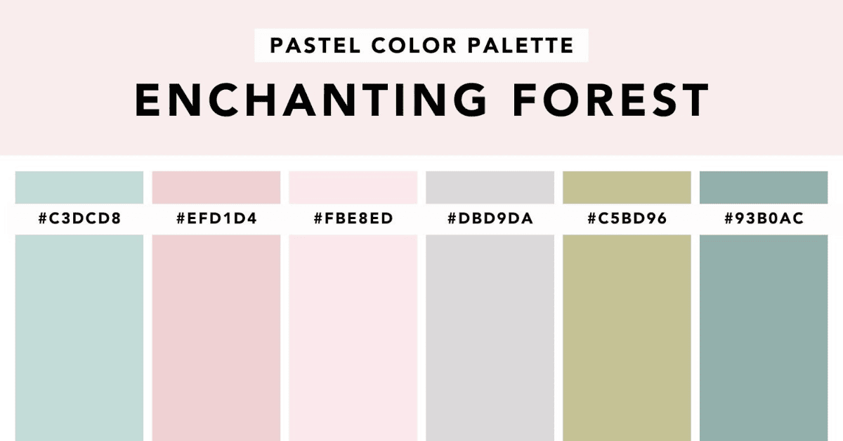
Pastel colors like mint green, peach, and lavender give a soft, calming effect. Perfect for lifestyle planners, journals, digital stickers, and cozy social media templates. Pastel palettes feel modern, minimalistic, and aesthetically pleasing.
Tips for Using Pastels:
- Combine 2–3 pastel colors for a harmonious look.
- Pair pastels with subtle textures to add depth.
- Ideal for female-targeted audiences, wellness, and lifestyle content.
Example Use:
A digital wedding planner template in peach and lavender can appeal to brides seeking soft, elegant designs.
Suggested Products from Landom.store:
- Pastel Planner Templates Bundle – fully editable in Canva or Photoshop.
- Soft Gradient Elements Pack – subtle overlays and accents.
3. Monochrome Elegance
Description:
Monochrome schemes use different shades of a single color to create a sleek and professional look. They are ideal for business templates, minimalist digital products, and professional portfolios.
Tips for Using Monochrome:
- Experiment with light and dark shades for contrast.
- Use patterns or textures to avoid flat designs.
- Works well with bold typography for a clean, elegant presentation.
Example Use:
A digital business card template in navy tones with silver text looks sophisticated and professional.
Suggested Products from Landom.store:
- Monochrome Template Pack – editable, ready-to-publish digital designs.
- Minimalist Icons Bundle – complements monochrome layouts perfectly.
4. Analogous Colors
Description:
Analogous colors are next to each other on the color wheel (e.g., blue, teal, green). They create visually cohesive and harmonious designs without harsh contrasts. Perfect for branding kits, social media templates, or any product needing smooth color transitions.
Tips for Using Analogous Colors:
- Choose one dominant color and two supporting colors.
- Avoid using more than three analogous colors to prevent visual clutter.
- Great for gradient backgrounds, infographic charts, or cohesive template packs.
Example Use:
A digital infographic template using shades of teal and green creates a calm and professional appearance.
Suggested Products from Landom.store:
- Branding Kit Templates – pre-matched analogous color schemes.
- Gradient Background Pack – seamless color blends for various digital projects.
5. Complementary Pop
Description:
Complementary colors are opposites on the color wheel, like purple and yellow. They create dramatic contrast that naturally draws the eye. Use these schemes for call-to-action buttons, key graphics, or accent elements.
Tips for Using Complementary Colors:
- Use one color as the main element and the opposite for highlights.
- Balance intensity to avoid visual fatigue.
- Perfect for promotional banners or products aimed at quick conversion.
Example Use:
A digital sale banner with a purple background and yellow text immediately grabs attention and encourages clicks.
Suggested Products from Landom.store:
- Promo Banner Templates – complementary color palettes ready for marketing campaigns.
- Accent Graphics Pack – perfect to emphasize important details in your designs.
Conclusion:
Mastering color schemes is essential for digital creators. From bold & vibrant to complementary pop, these strategies not only make your templates visually stunning but also increase engagement and sales. Combine these color tips with bundles, icons, and templates from landom.store to save time, maintain consistency, and produce professional-quality digital products that stand out in a crowded market.


 No products in the cart.