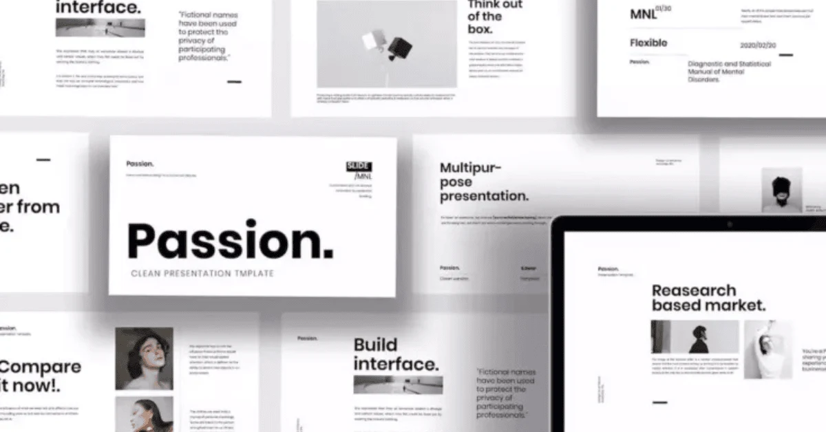
A great design is not just about pretty colors or fancy fonts. Even with the best visuals, a cluttered or disorganized layout can make your digital products look unprofessional and confuse your audience. Clean, well-structured layouts improve readability, make content more engaging, and help customers use your products effectively.
In this article, we’ll guide you step-by-step to create professional layouts for your templates, planners, and digital products, along with practical examples and suggestions from landom.store.
1. Define the Purpose of Your Layout
Before you start designing:
- Ask yourself: “What is the goal of this template?”
- Identify key elements (text, images, graphics, tables, forms).
- Prioritize content by importance.
Example:
For a digital planner, main sections might include monthly calendars, to-do lists, and notes. Highlight these areas visually to guide the user naturally.
2. Use Grids and Alignment
Grids are your best friend for professional layouts. They:
- Ensure consistent spacing between elements
- Help align text, images, and graphics
- Make the design look balanced
Tips:
- Use 2–4 column grids depending on content
- Align text and graphics along vertical and horizontal guides
- Maintain even margins for a clean look
Example:
A social media template with aligned image placeholders and text boxes creates a polished, cohesive design that’s easy to customize.
3. Incorporate Whitespace
Whitespace (or negative space) is not empty space—it’s essential for clarity.
- Prevents clutter
- Makes designs breathable and easier to navigate
- Highlights key elements
Tips:
- Use larger gaps between sections
- Don’t overcrowd text or images
- Let your design “breathe”
Example:
A clean ebook template with ample whitespace around headers, subheadings, and images improves readability and keeps the reader engaged.
4. Visual Hierarchy and Consistency
Visual hierarchy guides the viewer’s eye through your design. Use:
- Font size & style: Bigger, bolder text for headings
- Color & contrast: Highlight key sections or buttons
- Positioning: Place important info at the top or center
Consistency Tips:
- Stick to a color palette
- Maintain uniform font usage across templates
- Use repeated elements for familiarity
Example:
In a digital planner, monthly headers could use a bold font with brand colors, while day-to-day tasks use a smaller, simple font for clarity.
5. Optimize for Digital Use
- Ensure your layout works on multiple devices
- Test readability on mobile, tablet, and desktop
- Use scalable vector graphics (SVG) or high-resolution images
Example:
A Canva or Photoshop template with responsive graphics ensures users can edit and view your product without layout distortion.
6. Practical Tips & Tools
- Canva Grid and Alignment Tools: Quick way to snap elements perfectly
- Photoshop Guides & Smart Objects: Maintain proportion and consistency
- Pre-made Layout Templates: Save time with professional starting points
Shop/Product Suggestions from Landom.store
- Professional Layout Templates Bundle – pre-structured templates ready to edit
- Grid & Alignment Tools Pack – for Photoshop and Canva
- Complete Digital Planner Kit – includes clean, professional layouts for planners, journals, and marketing templates
Conclusion:
A clean and professional layout is the foundation of any high-quality digital product. By defining purpose, using grids, embracing whitespace, and maintaining visual hierarchy, you can create products that not only look beautiful but are highly functional. Pair these techniques with ready-to-use templates and tools from landom.store to save time and deliver exceptional digital products that impress your customers.


 No products in the cart.