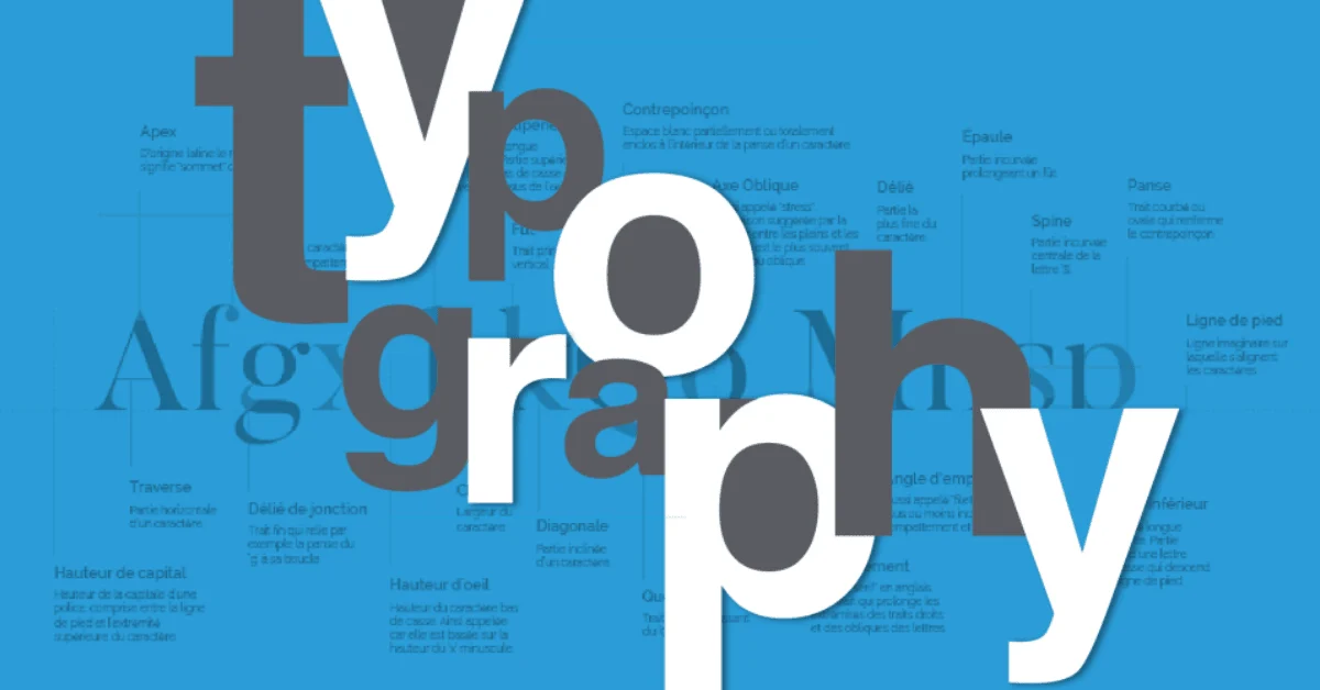
Imagine you’ve designed a beautiful template or digital planner, but your fonts make it hard to read or feel unprofessional. Fonts are more than letters – they convey tone, style, and emotion. Choosing the right typography can make your digital products look polished, professional, and appealing to buyers.
In this article, we’ll explore how to select fonts, combine them effectively, and suggest some resources from landom.store to make font selection easier and faster.
1. Understanding Font Categories
Serif Fonts – Fonts with small lines at the ends of characters (e.g., Times New Roman, Georgia). Ideal for professional, elegant, or print-oriented products like ebooks or reports.
Sans-Serif Fonts – Clean fonts without lines (e.g., Arial, Helvetica, Montserrat). Perfect for digital templates, web graphics, and modern designs.
Script Fonts – Handwritten or calligraphy styles. Great for invitations, social media graphics, or feminine designs. Use sparingly to maintain readability.
Display Fonts – Bold, decorative fonts meant for headings, banners, or standout elements. Use as accent fonts only.
2. Pairing Fonts Effectively
Combining fonts can be tricky. Here’s a simple formula:
- Primary + Secondary: Choose a main font for headings and a complementary one for body text.
- Contrast vs Harmony: Pair a serif with a sans-serif to create contrast.
- Limit to 2–3 fonts: Avoid clutter and maintain a professional look.
Example:
- Heading: Playfair Display (Serif)
- Body Text: Montserrat (Sans-Serif)
This creates a clean, elegant layout suitable for digital planners or marketing templates.
3. Readability Matters
Even the most beautiful font fails if it’s hard to read. Keep these tips in mind:
- Size: Body text should generally be 12–16 pt (or equivalent in pixels).
- Line Spacing: Enough space between lines prevents the design from feeling cramped.
- Contrast: Dark text on light backgrounds or vice versa ensures clarity.
Example:
A social media template using a delicate script font for headings can pair with a bold sans-serif body text to maintain readability while looking stylish.
4. Font Usage by Product Type
- Planners / Journals: Mix clean sans-serif body text with decorative script headings.
- Social Media Templates: Bold display fonts for main messages, easy-to-read sans-serif for captions.
- Marketing Materials / Banners: Strong contrast fonts to highlight key points or calls to action.
5. Practical Tips & Tools
- Use font pairing websites like Google Fonts Pairing or Fontjoy for inspiration.
- Test fonts on multiple devices to ensure readability.
- Stick to 2–3 font families per project for consistency.
Shop/Product Suggestions from Landom.store
- Digital Font Pack – a curated selection of modern, versatile fonts.
- Editable Template Bundle – pre-styled with recommended font combinations.
- Typography Resource Guide – tips, combinations, and ready-to-use styles for all digital products.
Conclusion:
Typography is one of the most crucial yet overlooked aspects of digital product design. The right fonts elevate your work, communicate the intended tone, and improve usability. Combine these tips with high-quality font packs and templates from landom.store to create beautiful, professional digital products that sell.


 No products in the cart.